Standard Form Validations
Overview
Form validations lets the user know that required fields are incomplete or have incorrect formatting, and that the form cannot post as a consequence. This feedback can be immediate, as each field is interacted with, (client-side validations) or only when the form is posted (server-side validations) Server side validations should be as close in interaction and appearance to the client side interaction. This documentation applies to basic forms. For information on how validations are applied to tables refer to AG Grid Validations
Structure
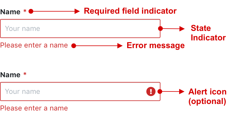
The standard form validation pattern is generally applied to a form element using the following:
- Required field indicator
- State indicator
- Error message
- Alert icon (optional)
Types of Validations
Form validations generally indicate the following:
- a required field is missing, or
- a value is not the expected value, or
- a value is not in the expected format
Validation messaging are either indicated using the Danger colour, or the Warning colour depending on the scenario.

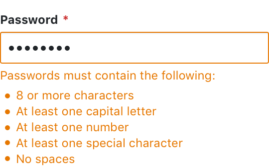
Example of a specific format that is required on validation
Example of a warning on validation
Language and Tone
Always be friendly in tone and speak plain English when communicating validation errors. Avoid technical jargon or wording that makes the user feel like they have done something wrong.
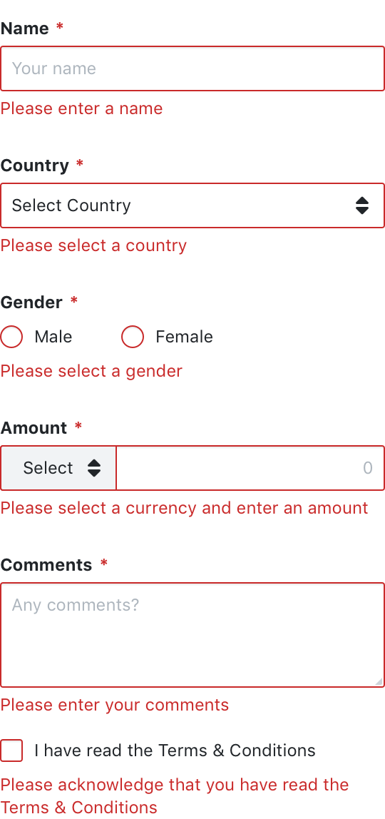
Form Elements & Validation Errors
All form elements must be able to communicate when there is a validation error.
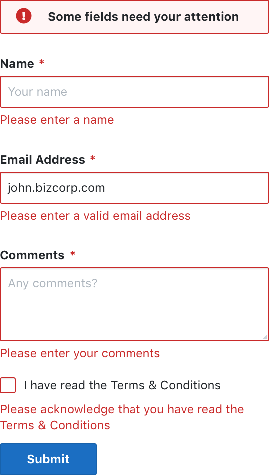
Combined with an alert
Form validations should always be combined with the Box Alert. The Box Alert will bring it to the users attention that there are validation errors and the form cannot be posted. This is especially important where server side errors apply or where form field might be hidden from view.