AG Grid Validations
In order to post the data contained in an AG Grid based table, a validation check has to be performed. The validation check is performed inline on each cell as it is completed, or on the table data as a whole when the form is posted.
Types of AG Grid validations
- inline validation flow
- form post validation flow
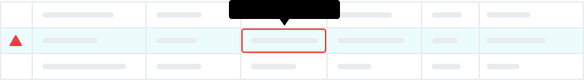
To ensure proper identification of the type of errors, location of errors and the resultant restrictions as a result of the errors, we use three distinct layers of validation error indicators:
- At cell level - this identifies the cells/form fields where the errors are occurring, and what the errors are
- At row level - this identifies the row where the errors are located, and which cells/fields are missing
- At form level - this identifies that the form contains validation errors and subsequently cannot post
Disclaimer: These flows are an ideal user experience to work towards from a UX point of view and have not been cleared by Product for implementation.
Inline validation flow (using keyboard)
The inline validation flow communicate validation errors at cell and at row level.
The example patterns offer two proposed flows based on either:
- highlighting the form fields
- highlighting the cells that contain the form fields
Form post validation flow
The form post validation flow communicate validation errors at form level, as well as on submit.

Feedback on whether the form can be posted, is communicated:
- pre-submit - via the submit bar in response to cell and row level validation errors
- post-submit - via toast alert
Invision wireframes with notes
Overview
The types of notifications depends on your requirements, but typically include the following:
- Actions performed by other users eg. comments on a shared workflow
- Actions performed by users in another system eg. updates to a shared resource
- Actions performed by the system eg. unavailability of a shared resource
Note: Messages that are delivered by the Alerts component (Banner, Box and Toast Alerts) should not be included as notifications. This will lead to confusion and duplication.
Structure
Notifications should be non-invasive and non-interruptive, therefore are limited to:
- a counter and panel trigger in the header
- a panel where the notifications are read, managed and settings applied
Specific controls are available on hover that allow notifications to be marked as read or removed.
Settings
Notifications can be configured via a Settings panel. Settings should be kept simple by sticking to on/off switches.
Email Integration
Notifications can be configured to send the user email summaries and reminders.
Email summaries examples:
Email reminder examples:
Behaviour
An clickable prototype that demonstrates the basic interactions is available in Invision