Tooltips
A tooltip presents a concise piece of contextual information on an element on the screen, in response to a user action (hover, focus or click). Tooltips should always play a supplementary or enhancement role and never contain critical information.
Base
These popovers are CSS only. The base have no color but multiple direction options.
<span data-tooltip="Tooltip Text" class="c-btn c-btn-secondary c-m-horizontal-md">
  Default
</span>
<span data-tooltip="Tooltip Text" data-tooltip-conf="bottom" class="c-btn c-btn-secondary c-m-horizontal-md">
  Down
</span>
<span data-tooltip="Tooltip Text" data-tooltip-conf="right" class="c-btn c-btn-secondary c-m-horizontal-md">
  Right
</span>
<span data-tooltip="Tooltip Text" data-tooltip-conf="shadow left" class="c-btn c-btn-secondary c-m-horizontal-md">
  Left
</span>Colors
<span data-tooltip="Tooltip Text" class="c-btn c-btn-secondary c-m-horizontal-md">
  Default
</span>
<span data-tooltip="Tooltip Text" data-tooltip-conf="invert shadow" class="c-btn c-btn-secondary c-m-horizontal-md">
  Invert
</span>
<span data-tooltip="Tooltip Text" data-tooltip-conf="primary" class="c-btn c-btn-secondary c-m-horizontal-md">
  Primary
</span>
<span data-tooltip="Tooltip Text" data-tooltip-conf="success" class="c-btn c-btn-secondary c-m-horizontal-md">
  Success
</span>
<span data-tooltip="Tooltip Text" data-tooltip-conf="warning" class="c-btn c-btn-secondary c-m-horizontal-md">
  Warning
</span>
<span data-tooltip="Tooltip Text" data-tooltip-conf="danger" class="c-btn c-btn-secondary c-m-horizontal-md">
  Danger
</span>Additional Options
<span data-tooltip="A pure CSS Tooltip. Super easy to use, No JavaScript required." data-tooltip-conf="primary multiline" class="c-btn c-btn-secondary c-m-horizontal-md">
    Multiline
  </span>
  <span data-tooltip="Tooltip Text" data-tooltip-conf="no-fade" class="c-btn c-btn-secondary c-m-horizontal-md">
    No Fade
  </span>
  <span data-tooltip="Tooltip Text" data-tooltip-conf="shadow" class="c-btn c-btn-secondary c-m-horizontal-md">
    Shadow
  </span>
  <span data-tooltip="Tooltip Text" data-tooltip-conf="no-arrow" class="c-btn c-btn-secondary c-m-horizontal-md">
    No Arrow
  </span>
  <span data-tooltip="Tooltip Text" data-tooltip-conf="square" class="c-btn c-btn-secondary c-m-horizontal-md">
    Square
</span>Storybook iframe
Types & Usage
| Type | Description |
|---|---|
| Icon / Button Tooltip | These Tooltips are used to provide context or details around icons and buttons |
| Definition Tooltip | Definition Tooltips provide contextual information to a word, request, action, or element |
| Interactive Tooltip | TInteractive Tooltips are tooltips which contain interactive elements such as buttons or links. These tooltips remain visible until intentionally dismissed. |
States
Tooltips should appear on hover, focus or click.
Labels
Tooltips should be written as short and concise as possible. When you require more than a few words consider using popovers or other patterns more suitable to communicating complexity to the user.
Best Practices
- Tooltips should always play a supplementary or enhancement role and never contain critical information.
- Use sentence case with no punctuation unless absolutely required for clarity
- Tooltips used to display shortcut keys should use a uniform format (key + key + key)
- In instances where tooltips are used to display user inputted information, case rules do not apply. Tooltips should mirror user input exactly.
- Do try to keep tooltips above the items or elements being highlighted
- Do keep the position of the tooltips consistent when edge or component overflow does not affect placement
Examples
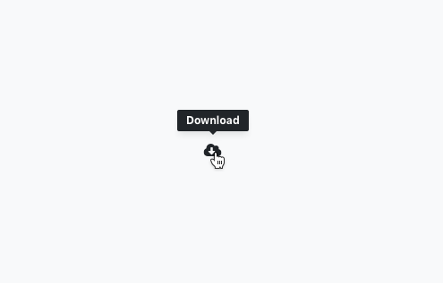
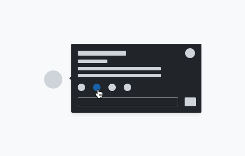
Example: Icon tooltip used to clarify the action or name of an icon button
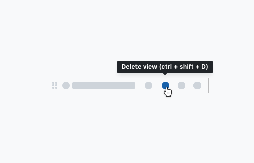
Example: Tooltip used to display keyboard shortcuts
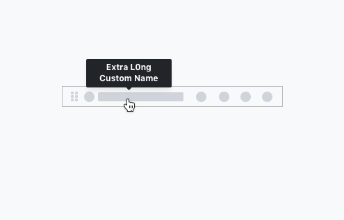
Example: User inputted information should show user input exactly as the user typed it
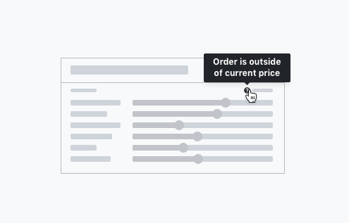
Example: Definition tooltip used to provide contextual information to a word, request, action, or element
Example: Interactive tooltips span from simple buttons or hyperlinks to more complex modules