Switches
Switches are a type of selection control, offering a quick way to toggle between two states. Changing a state is immediate and continuous.
Switch
The default switch is available in default and Large size.
<label class="c-switch">
  <input type="checkbox">
  <span class="c-switch-handle"></span>
</label><label class="c-switch c-switch-lg">
<input type="checkbox">
<span class="c-switch-handle"></span>
</label>Adding label text.
<label class="c-switch">
  <input type="checkbox">
  <span class="c-switch-handle"></span>
  <label class="c-switch-label">Default with label</label>
</label><label class="c-switch c-switch-lg">
<input type="checkbox">
<span class="c-switch-handle"></span>
<label class="c-switch-label">Default with label</label>
</label>Adding disabled to the input.
<label class="c-switch">
  <input type="checkbox" disabled>
  <span class="c-switch-handle"></span>
</label><label class="c-switch c-switch-lg">
<input type="checkbox" disabled>
<span class="c-switch-handle"></span>
</label>Adding disabled to the input and label - where label text stays normal.
<label class="c-switch">
  <input type="checkbox" disabled>
  <span class="c-switch-handle"></span>
  <label class="c-switch-label">Default with switch disabled</label>
</label><label class="c-switch c-switch-lg">
<input type="checkbox" disabled>
<span class="c-switch-handle"></span>
<label class="c-switch-label">Large with switch disabled</label>
</label>Adding disabled to the input and label - where label is disabled as well.
<label class="c-switch c-switch-disabled">
  <input type="checkbox" disabled>
  <span class="c-switch-handle"></span>
  <label class="c-switch-label">Default with switch disabled</label>
</label><label class="c-switch c-switch-lg c-switch-disabled">
<input type="checkbox" disabled>
<span class="c-switch-handle"></span>
<label class="c-switch-label">Large with switch disabled</label>
</label>Adding disabled to the input when checked.
<label class="c-switch">
  <input type="checkbox" checked disabled>
  <span class="c-switch-handle"></span>
  <label class="c-switch-label">Default with switch selected and disabled</label>
</label><label class="c-switch c-switch-lg">
<input type="checkbox" checked disabled>
<span class="c-switch-handle"></span>
<label class="c-switch-label">Large with switch selected and disabled</label>
</label>Adding disabled to the input and label when checked.
<label class="c-switch c-switch-disabled">
  <input type="checkbox" checked disabled>
  <span class="c-switch-handle"></span>
  <label class="c-switch-label">Default with switch and label disabled</label>
</label><label class="c-switch c-switch-lg c-switch-disabled">
<input type="checkbox" checked disabled>
<span class="c-switch-handle"></span>
<label class="c-switch-label">Large with switch and label disabled</label>
</label>Additional
Although not encouraged for general useage - additional colors are available.
<label class="c-switch c-switch-primary">
  <input type="checkbox" checked>
  <span class="c-switch-handle"></span>
  <label class="c-switch-label"></label>
</label>

<label class="c-switch c-switch-success">
  <input type="checkbox" checked>
  <span class="c-switch-handle"></span>
  <label class="c-switch-label"></label>
</label>

<label class="c-switch c-switch-warning">
  <input type="checkbox" checked>
  <span class="c-switch-handle"></span>
  <label class="c-switch-label"></label>
</label>

<label class="c-switch c-switch-danger">
  <input type="checkbox" checked>
  <span class="c-switch-handle"></span>
  <label class="c-switch-label"></label>
</label>


<label class="c-switch c-switch-lg c-switch-primary">
  <input type="checkbox" checked>
  <span class="c-switch-handle"></span>
  <label class="c-switch-label"></label>
</label>

<label class="c-switch c-switch-lg c-switch-success">
  <input type="checkbox" checked>
  <span class="c-switch-handle"></span>
  <label class="c-switch-label"></label>
</label>

<label class="c-switch c-switch-lg c-switch-warning">
  <input type="checkbox" checked>
  <span class="c-switch-handle"></span>
  <label class="c-switch-label"></label>
</label>

<label class="c-switch c-switch-lg c-switch-danger">
  <input type="checkbox" checked>
  <span class="c-switch-handle"></span>
  <label class="c-switch-label"></label>
</label>You can also add text to the large switch size. Again, use carefully - anything other than ON/OFF text is outside of the intended usage.
<label class="c-switch c-switch-lg c-switch-primary">
  <input type="checkbox" checked>
  <span class="c-switch-handle"></span>
  <label class="c-switch-label" data-on="On" data-off="Off"></label>
</label>

<label class="c-switch c-switch-lg c-switch-success">
  <input type="checkbox" checked>
  <span class="c-switch-handle"></span>
  <label class="c-switch-label" data-on="On" data-off="Off"></label>
</label>

<label class="c-switch c-switch-lg c-switch-warning">
  <input type="checkbox" checked>
  <span class="c-switch-handle"></span>
  <label class="c-switch-label" data-on="On" data-off="Off"></label>
</label>

<label class="c-switch c-switch-lg c-switch-danger">
  <input type="checkbox" checked>
  <span class="c-switch-handle"></span>
  <label class="c-switch-label" data-on="On" data-off="Off"></label>
</label>Switch
Switch 2.0
Overview
Switches have 4 different states:
-
Active
-
Inactive
-
Active (disabled)
-
Inactive (disabled)
Types of switches available:
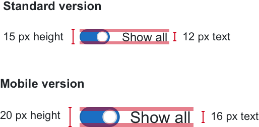
- Standard version
- Mobile version The mobile version has a bigger hit area and larger text for better performance on smaller mobile screens.
Usage
-
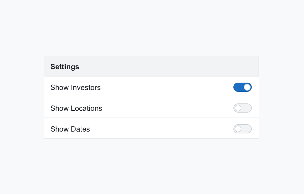
As a selection control in Settings pages
-
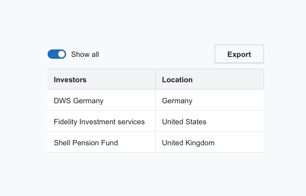
As a selection control combined with tables, data visualisations, etc.
-
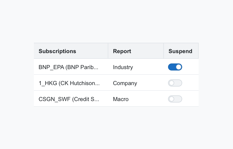
As a selection control in tables
Combined with labels
Switches should be combined with accompanying text or a label.
Label best practices:
-
Keep label text short and concise
-
Always place the label on the right
-
Use sentence style capitalisation for label text
-
Don’t add additional characters or punctuation at the end of each label
-
Labels should be vertically centred relative to the switch (see example)
Best Practices
-
Always use switches in combination with accompanying text or a label
-
Avoid using switches in forms where the settings need to be saved or applied before taking effect
Examples
A selection control in Settings pages
A selection control combined with tables, data visualisations, etc.
A selection control in tables