Loaders
Loader animations are used to indicate a transitional state where content is in the process of loading.
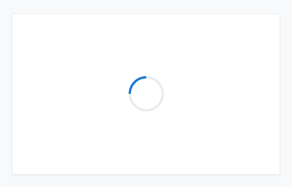
Application loader
<div class="c-card">
  <div class="c-card-content c-m-top-lg c-m-bottom-lg c-full-page-loader-logo">
  </div>
</div>Content Loader
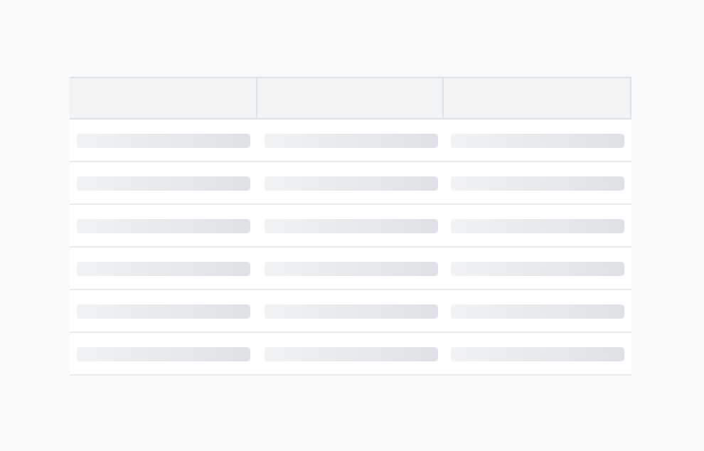
<div class="c-full-page-loader"></div>Skeleton Loaders
<div class="c-card">
    <div class="c-card-content">
      <div class="c-skeleton-loading"></div>
      <hr class="c-hr">
      <div class="c-skeleton-loading"></div>
    </div>
</div>Basic Loader
IHS Markit Loader
Overview
Placement & Behaviour
All loaders sit vertically and horizontally centered in a container. The animation repeats indeterminately until the relevant content is loaded, at which point it is replaced.
Best Practices
-
Do not scale the animation icon
-
Always centre the icon in the container
-
Use loader icons only on white or light grey backgrounds
-
Do not combine the loader icon with text
Types & Usage
| Type | Usage |
|---|---|
| Application loader | Used on initial application load ie. when a user signs into their account or a page is shared with an external party |
| Content Loader | Used when loading all content within the content area of a page or a container, usually when navigating within the same application |
| Skeleton Loader | Used when loading smaller repeat pieces of content, like lists or table data |
Examples
An application loader displays while an application loads
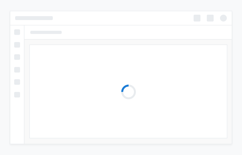
A content loader displays while the contents of a container loads
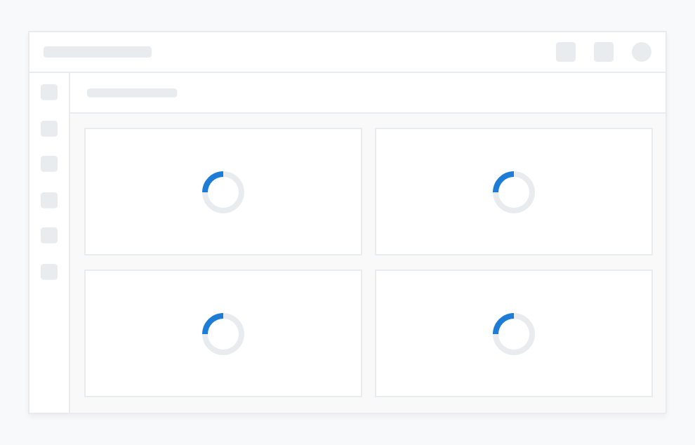
Multiple content loaders display in cards while each cards’s content loads in isolation
Use of a skeleton loader indicates that list-based information will load into this card
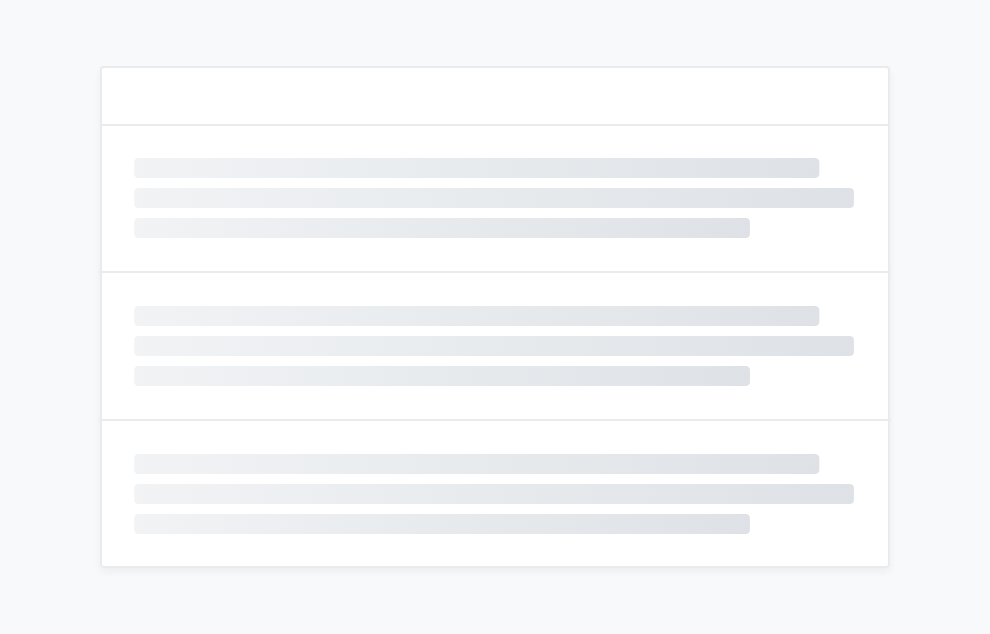
A skeleton loader is recommended for use as a loader that precludes table content