Forms
Forms allow users to enter data into an application, or to configure options.
Form Input
A text field is an input field that a user can type into. It has a range of options and supports several text formats.
<input class="c-input" type="text" placeholder="Text input">Color Examples
This is an example of available colors for the Forms element.
-
An error state kicks in when the user input is missing or not in the correct format. The user cannot progress past the error state until it has been corrected.
-
A warning state kicks in when the user input is in a less desirable format than preferred by the system. The user can still progress past the warning state, but is given the opportunity to course correct to a more desirable format.
<input class="c-input c-input-primary" type="text" placeholder="Primary input">

<input class="c-input c-input-success" type="text" placeholder="Success input">

<input class="c-input c-input-warning" type="text" placeholder="Warning input">

<input class="c-input c-input-error" type="text" placeholder="Error input">Size Examples
This is an example of available size’s for the Forms element.
<input class="c-input c-input-sm" type="text" placeholder="Sm input">

<input class="c-input c-input-lg" type="text" placeholder="Lg input">Disabled state
Make buttons look inactive by adding the disabled boolean attribute to any
<input class="c-input" type="text" placeholder="Disabled Input" disabled>Labels
<div class="c-row">
<div class="c-col-md-2">
  <label for="forms-input-warning" class="c-input-label">Label:
    <sup class="c-text-danger">*</sup></label>
</div>
<div class="c-col-md-10">
    <input type="text" id="forms-input" placeholder="Text input" class="c-input">
</div>
</div>Helper Text
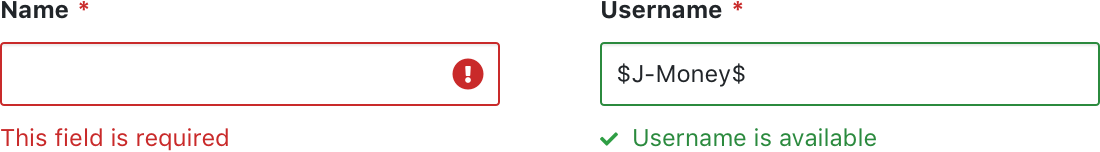
Static always visible
<div class="c-input-container">
  <input class="c-input c-input-success" type="text" placeholder="Text input" value="$J-Money$" id="input-helper-1">
  <span class="c-hint c-hint-static c-hint-success">
    <i class="fa fa-check"></i> This username is silly but available!</span>
</div>Text appears on focus.
<div class="c-input-container">
  <input class="c-input c-input-error" type="text" placeholder="Click in here to see helper text" value id="input-helper-1">
  <span class="c-hint c-hint-error"><i class="fas fa-exclamation-circle"></i> I animate in when input is focused!</span>
</div>Icons inside inputs
<div class="c-row">
<div class="c-col-md-2">
  <label for="forms-input-warning" class="c-input-label">Label:
    <sup class="c-text-danger">*</sup></label>
</div>
<div class="c-col-md-10">
 <div class="c-input-container">
    <input type="text" id="forms-input-warning" placeholder="Warning" class="c-input c-input-warning">
    <i class="fa fa-exclamation-circle c-input-icon"></i>
  </div>
</div>
</div>Input Add-ons
<div class="c-input-group">
  <div class="c-input-addon">@</div>
  <div class="c-input-container">
    <input type="text" class="c-input">
  </div>
</div>

<br>

<div class="c-input-group">
  <div class="c-input-addon">$</div>
  <div class="c-input-container">
    <input type="text" class="c-input">
  </div>
  <div class="c-input-addon">.00</div>
</div>

<br>

<div class="c-input-group">
  <div class="c-input-addon">
    <label class="c-checkbox">
      <input type="checkbox" name="radio" checked>
      <label></label>
    </label>
  </div>
  <div class="c-input-container">
    <input type="text" class="c-input">
  </div>
</div>

<br>

<div class="c-input-group">
  <div class="c-input-addon">
    <label class="c-radio">
      <input type="radio" name="radio">
      <label></label>
    </label>
  </div>
  <div class="c-input-container">
    <input type="text" class="c-input">
  </div>
</div>Add Buttons at any size
<div class="c-input-group">
  <button class="c-btn c-btn-primary c-btn-sm">Action</button>
  <div class="c-input-container">
    <input type="text" class="c-input c-input-sm" placeholder="sm Input with Button Add-On" id="input-group-1">
  </div>
</div>
<br>

<div class="c-input-group">
  <button class="c-btn c-btn-primary c-btn-lg">Action</button>
  <div class="c-input-container">
    <input type="text" class="c-input c-input-lg" placeholder="lg Input with Button Add-On" id="input-group-1">
  </div>
</div>
<br><div class="c-input-group">
<div class="c-input-container">
<input type="text" class="c-input c-input-sm" placeholder="sm Input with Button Add-On">
</div>
<button class="c-btn c-btn-primary c-btn-sm">Action</button>
<button class="c-btn c-btn-primary c-btn-sm c-btn-box"><i class="fa fa-caret-down"></i></button>
</div>
<br>
<div class="c-input-group">
<div class="c-input-container">
<input type="text" class="c-input c-input-lg" placeholder="lg Input with Button Add-On">
</div>
<button class="c-btn c-btn-primary c-btn-lg">Action</button>
<button class="c-btn c-btn-primary c-btn-lg c-btn-box"><i class="fa fa-caret-down"></i></button>
</div>
<br>Elements Inline
<div class="c-m-bottom-md c-text-md">
  <span class="c-m-right-sm c-text-md c-text-bold">Begin</span>
  <button class="c-btn c-btn-primary c-btn-sm">Primary Button</button>
  <span class="c-m-horizontal-sm c-text-lg">More Text</span>
  <input placeholder="placeholder text" type="text" class="c-input c-input-sm c-input-inline">
  <span class="c-m-horizontal-sm c-text-lg">Everything aligns nicely here!</span>
  <button class="c-btn c-btn-secondary c-btn-sm">user <i class="fa fa-user"></i></button>
</div><div class="c-m-bottom-md">
<span class="c-m-right-sm c-text-lg c-text-bold">Begin</span>
<button class="c-btn c-btn-success">Success Button</button>
<span class="c-m-horizontal-sm c-text-lg">More Text</span>
<input type="text" placeholder="placeholder text" class="c-input c-input-inline">
<span class="c-m-horizontal-sm c-text-lg">Everything aligns nicely here!</span>
<button class="c-btn c-btn-success">
<i class="fa fa-star"></i> Info
</button>
</div><form class="c-form-inline">
<label class="c-input-label" for="size-input-2">Danger Label: <sup class="c-text-danger">*</sup></label>
<input class="c-input c-input-error c-m-horizontal-md" type="text" id="size-input-2" placeholder="Normal input">
<span class="c-hint c-hint-error c-hint-static"><i class="fa fa-check"></i> I'm static!</span>
<button type="button" class="c-btn c-btn-secondary c-m-horizontal-md">Button</button>
</form>Textarea
<div class="c-form-group">
  <textarea class="c-input" placeholder="Placeholder Text"></textarea>
</div>Define Height
You can set the height of the textarea using the rows HTML attribute.
<div class="c-form-group">
  <textarea class="c-input" placeholder="10 lines of textarea" rows="10"></textarea>
</div>Textarea Colors
<textarea class="c-input c-input-primary" type="text" placeholder="Primary input">
</textarea>

<textarea class="c-input c-input-success" type="text" placeholder="Success input">
</textarea>

<textarea class="c-input c-input-warning" type="text" placeholder="Warning input">
</textarea>

<textarea class="c-input c-input-error" type="text" placeholder="Error input">
</textarea>Textarea Sizes
<textarea class="c-input c-input-sm" type="text" placeholder="Sm input">
</textarea>

<textarea class="c-input c-input-lg" type="text" placeholder="Lg input">
</textarea>Select
The browser built-in select dropdown, styled accordingly
<select class="c-input">
  <option>Select dropdown</option>
  <option>With options</option>
</select>Select Sizes
<select class="c-input c-input-sm">
  <option>Select dropdown</option>
  <option>With options</option>
</select>

<select class="c-input c-input-lg">
  <option>Select dropdown</option>
  <option>With options</option>
</select>Disabled
<select class="c-input" disabled>
  <option>Select dropdown</option>
  <option>With options</option>
</select>File Upload
Some basic styling for file upload areas.
<div class="c-file-upload">
  File Upload
  <button class="c-btn c-btn-sm c-btn-primary"> Button </button>
</div>Base Input
Input Colors
Input Groups with Addons
Input Groups with Addon Button
Label and Hint Text
Character Limit
Validation / Layout Demo
Text Area - Base
Text Area - Group
Text Area - Character Limit
Overview
Types
Forms can be made up of, but are not restricted to, the following form elements:
-
input
-
textarea
-
select
-
radio
-
checkbox
-
file upload
States
Form elements generally have the following states:
-
default
-
active
-
disabled
-
error
Sizes
Form elements come in 3 sizes:
-
small (use in table cells)
-
default (general use)
-
large (mobile)
Combined with labels
Form elements can generally be combined with labels in the following 2 layouts:
-
vertical stacked (recommended for longer forms)
-
horizontal line up (short forms)
-
Required fields are indicated by adding a colour coded asterisk * to the end of the label.
Combined with helper text
Form elements can be combined with helper text, for the following (but not restricted to) scenarios:
-
validation errors
-
guidance
-
confirmations
Input field modifications
Input fields can be modified for various requirements:
-
Input add-ons
-
Icons inside input field (validations)
-
Combined with buttons
-
Combined with dropdown buttons
Validations
Validation requires form elements to change state and display additional helper text and alerts. See Form Validations under Patterns for more guidance.
Form Layout
Form layout will depend on the form requirements and where it is embedded. See Form Layout under Patterns for more guidance.
Examples
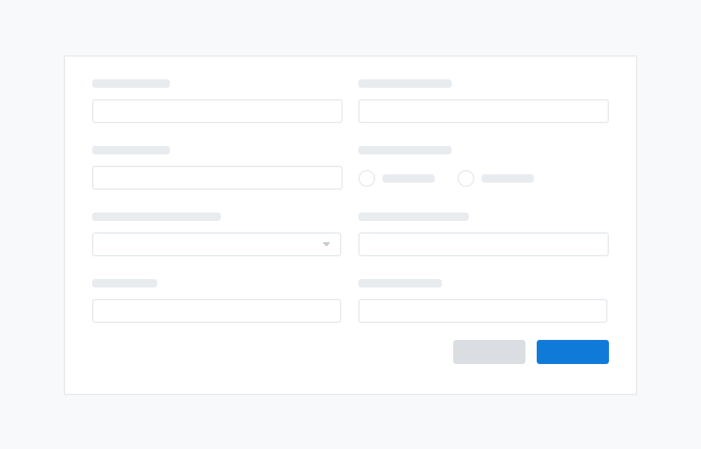
A large form with a combination of form elements
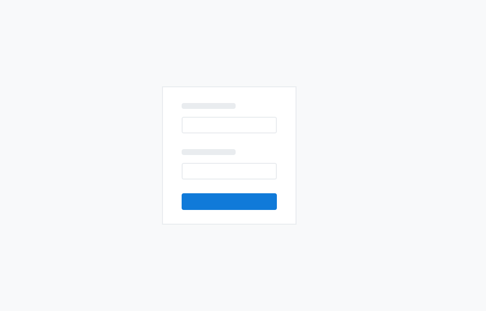
A Login form