Dropdowns
Dropdown menus allow users to select an action, single option or selection of options from a set of choices.
Basic Dropdown
With simple list items below the toggle
<div class="c-dropdown">
	<button class="c-btn c-btn-secondary">
		Dropdown
		<i class="fa fa-angle-down" aria-hidden="true"></i>
	</button>
	<div class="c-dropdown-list c-dropdown-list-below">
		<a class="c-dropdown-item" href="#">Item 1</a>
		<a class="c-dropdown-item" href="#">Item 2</a>
		<a class="c-dropdown-item" href="#">Item 3</a>
	</div>
</div>Adding icons inline
<span class="c-dropdown">
<button class="c-btn c-btn-secondary">
	Dropdown
<i class="fa fa-angle-down" aria-hidden="true"></i>
</button>

<div class="c-dropdown-list c-dropdown-list-below">
	<a class="c-dropdown-item" href="#">
		<span class="c-dropdown-icon fas fa-cut"></span>
		Cut
	</a>
	<a class="c-dropdown-item" href="#">
		<span class="c-dropdown-icon fas fa-copy"></span>
		Copy
	</a>
	<a class="c-dropdown-item" href="#">
		<span class="c-dropdown-icon fas fa-paste"></span>
		Paste
	</a>
</div>
</span>Adding a heading, divider, and right text options
<span class="c-dropdown">
<button class="c-btn c-btn-secondary">
	Dropdown
<i class="fa fa-angle-down" aria-hidden="true"></i>
</button>

<div class="c-dropdown-list c-dropdown-list-below">
<div class="c-dropdown-heading">Group heading</div>
<div class="c-dropdown-divider"></div>
	<a class="c-dropdown-item" href="#">
		<span class="c-dropdown-icon fas fa-cut"></span>
		Cut
		<span class="c-pull-right c-badge c-badge-sm c-badge-indigo">Right</span>
	</a>
	<a class="c-dropdown-item" href="#">
		<span class="c-dropdown-icon fas fa-copy"></span>
		Copy
	</a>
	<a class="c-dropdown-item" href="#">
		<span class="c-dropdown-icon fas fa-paste"></span>
		Paste
	</a>
</div>
</span>With text colors
<span class="c-dropdown">
<button class="c-btn c-btn-secondary">
	Dropdown
<i class="fa fa-angle-down" aria-hidden="true"></i>
</button>

<div class="c-dropdown-list c-dropdown-list-below">
	<a class="c-dropdown-item c-text-primary" href="#">
		.c-text-primary
	</a>
	<a class="c-dropdown-item c-text-success" href="#">
		.c-text-success
	</a>
	<a class="c-dropdown-item c-text-warning" href="#">
		.c-text-warning
	</a>
	<a class="c-dropdown-item c-text-danger" href="#">
		.c-text-danger
	</a>
	<a class="c-dropdown-item c-text-muted" href="#">
		.c-text-muted
	</a>
</div>
</span>With checkboxes
<span class="c-dropdown">
<button class="c-btn c-btn-secondary">
	Dropdown
<i class="fa fa-angle-down" aria-hidden="true"></i>
</button>

<div class="c-dropdown-list c-dropdown-list-below">
	<span class="c-dropdown-item">
		<div class="c-checkbox">
			<input type="checkbox" id="demo" name="radio" checked>
			<label></label>
		</div>
		Checkbox
	</span>
	<span class="c-dropdown-item">
		<div class="c-checkbox">
			<input type="checkbox" id="demo" name="radio">
			<label></label>
		</div>
		Checkbox
	</span>
	<span class="c-dropdown-item">
		<div class="c-checkbox">
			<input type="checkbox" id="demo" name="radio">
			<label></label>
		</div>
		Checkbox
	</span>
</div>
</span>With selected class
<span class="c-dropdown">
<button class="c-btn c-btn-secondary">
	Dropdown
<i class="fa fa-angle-down" aria-hidden="true"></i>
</button>

<div class="c-dropdown-list c-dropdown-list-below">
	<a class="c-dropdown-item" href="#">
		<span class="c-dropdown-icon fas fa-cut"></span>
		Cut
	</a>
	<a class="c-dropdown-item" href="#">
		<span class="c-dropdown-icon fas fa-copy"></span>
		Copy
	</a>
	<a class="c-dropdown-item c-dropdown-item-selected" href="#">
		<span class="c-dropdown-icon fas fa-paste"></span>
		Paste
	</a>
	<div class="c-dropdown-divider"></div>
	<a class="c-dropdown-item" href="#">
		<span class="c-dropdown-icon fas fa-download"></span>
		Download
	</a>
	<a class="c-dropdown-item" href="#">
		<span class="c-dropdown-icon fas fa-cog"></span>
		Settings
	</a>
</div>
</span>List Location
<span class="c-dropdown">
<button class="c-btn c-btn-primary">
    Default (cover) <i class="fa fa-angle-down" aria-hidden="true"></i>
</button>
<ul class="c-dropdown-list">
    <a class="c-dropdown-item" href="#">Option 1</a>
    <a class="c-dropdown-item" href="#">Option 2</a>
    <a class="c-dropdown-item" href="#">Option 3</a>
</ul>
</span>

<span class="c-dropdown">
<button class="c-btn c-btn-primary">
    Dropdown List Below <i class="fas fa-angle-down" aria-hidden="true"></i>
</button>
<div class="c-dropdown-list c-dropdown-list-below">
    <a class="c-dropdown-item" href="#">Option 1</a>
    <a class="c-dropdown-item" href="#">Option 2</a>
    <a class="c-dropdown-item" href="#">Option 3</a>
</div>
</span>

<span class="c-dropdown">
<button class="c-btn c-btn-primary">
    Dropdown List Above <i class="fa fa-angle-down" aria-hidden="true"></i>
</button>
<div class="c-dropdown-list c-dropdown-list-above">
  <a class="c-dropdown-item" href="#">Option 1</a>
  <a class="c-dropdown-item" href="#">Option 2</a>
  <a class="c-dropdown-item" href="#">Option 3</a>
</div>
</span>

<span class="c-dropdown">
<button class="c-btn c-btn-primary">
    Dropdown List right <i class="fa fa-angle-down" aria-hidden="true"></i>
</button>
<div class="c-dropdown-list c-dropdown-list-below c-dropdown-list-right">
  <a class="c-dropdown-item" href="#">Option 1</a>
  <a class="c-dropdown-item" href="#">Option 2</a>
  <a class="c-dropdown-item" href="#">Option 3</a>
</div>
</span>Sectioned Dropdown
Overview
Usage
Use dropdown menus wherever users need to make a selection outside of a form. For selections in a form refer to the Select element in Form Elements.
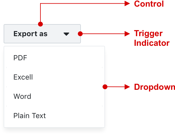
Structure
A dropdown menu is composed of a:
-
control
-
trigger indicator (optional)
-
dropdown menu
Behaviour
When the control is triggered, a dropdown menu slides out to reveal a set of choices. The dropdown menu can slide up, down, left or right. This is either pre-determined or influenced by proximity to the browser frame.
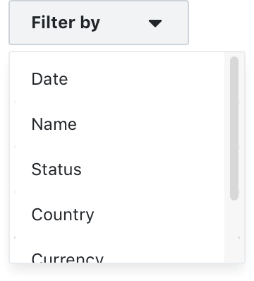
Dropdown menus are by default not scrollable, but can be made to scroll for long lists such as filters.
Dropdown menus can be closed by:
-
selecting an item
-
clicking the dropdown control
-
clicking anywhere on the page
States
Dropdown buttons generally have the following states:
-
default
-
hover
-
active
-
disabled
Labels
Limit wording on dropdown labels to two to three words max. Try and use wording and terms that need no additional explanation.
Menu items
Dropdown menu items have different configurations depending on the requirements.
Some options and application examples:
-
text only (select an action eg. export)
-
icon + text (standard menu item eg. sign out)
-
checkbox + text (multiple selections eg. select filters)
-
text + badge (new menu item)
Grouping and dividers
Relevant menu items can be grouped under a non selectable heading. Dividers can separate grouped menu items.
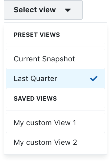
Selected & pre-selected items
Selected and pre-selected items should be visible with a selected class applied to the menu item.
Combined with a dropdown button
Dropdown menus are typically combined with a dropdown button, but can also be triggered by other controls.
Combined with other controls
Dropdown menus can also be triggered by specific controls:
-
icon buttons (for instance the More menu)
-
avatars (account menu)
-
Text link as dropdown control (table filters and column selectors)
Best practices
-
Use dropdown menus only where it is the most suitable selection control for the job
-
Dropdown menu use on mobile devices need additional considerations
-
Always indicate if an item is selected or pre-selected
-
Always disable or remove items that are not otherwise available or selectable
-
Keep all wording short and concise
-
Truncate menu items that extend beyond the container border
-
Only vertical scrolling (for an appropriate use case) is recommended. Avoid horizontal scrolling.
Examples
A dropdown with a list that extends beyond its max height can be configured to scroll
A header groups export options and dividers seperate or group relevant links
A selected state indicates that a selection is currently active
A button icon triggers a “more” menu and a badge indicates that a link has recently been added
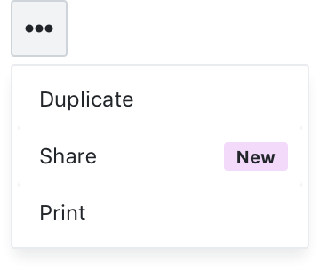
An account avatar triggers a dropdown with account and user related options
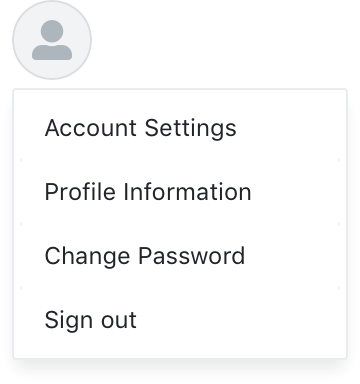