Comparison
Comparison graphs and data visualizations are the most common method of analysis.
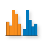
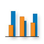
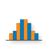
Comparison Graph Types
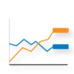
Implied by the name, these visualizations can easily compare values between 2 or more data points. These include bar charts, column graphs, and time trends. Comparison graphs would be used to answer these questions:
- Which value between 2 or more data points is higher/lower?
- Does the user need to quickly find and read key values from a list (i.e. cost per quarter)?
- Does the user need to see categories ranked (i.e. products from most to least profitable)?
-
What trends over time does the data suggest (gaps, spikes, outliers)?