Checkboxes
Checkboxes allow users to select none, one or multiple options from a pre-defined list of options.
Checkbox
The default checkbox requires the <label></label> tag even if no text is provided.
<div class="c-checkbox">
	<input type="checkbox" name="check">
	<label></label>
</div>Adding label text that is not clickable.
<div class="c-checkbox">
	<input type="checkbox" name="check">
	<label>Label Text</label>
</div>To make the full label clickable - supply the input with an id and the label with a a matching for value as shown below.
<div class="c-checkbox">
  <input type="checkbox" id="checkbox1" name="check">
  <label for="checkbox1">Default with Label</label>
</div>Adding disabled to the input.
<div class="c-checkbox">
  <input type="checkbox" id="checkbox2" name="check" disabled>
  <label for="checkbox2">This is still a normal label</label>
</div>Adding disabled to the input and label.
<div class="c-checkbox" disabled>
  <input type="checkbox" id="checkbox3" name="checkbox" disabled>
  <label for="checkbox3">This label is disabled</label>
</div>Adding disabled to a checked input.
<div class="c-checkbox">
  <input type="checkbox" id="checkbox4" name="checkbox" checked="checked" disabled>
  <label for="checkbox4">This is still a normal label</label>
</div>Adding disabled to a checked input and label.
<div class="c-checkbox" disabled="">
  <input type="checkbox" id="checkbox5" name="checkbox4" checked="checked" disabled="">
  <label for="checkbox5">This label is disabled</label>
</div>Checkbox
Checkbox 2.0
Overview
States
Checkboxes have 4 potential states:
-
active
-
inactive
-
active (disabled)
-
inactive (disabled)
Usage
-
multiple selection controls in forms
-
standalone checkboxes
-
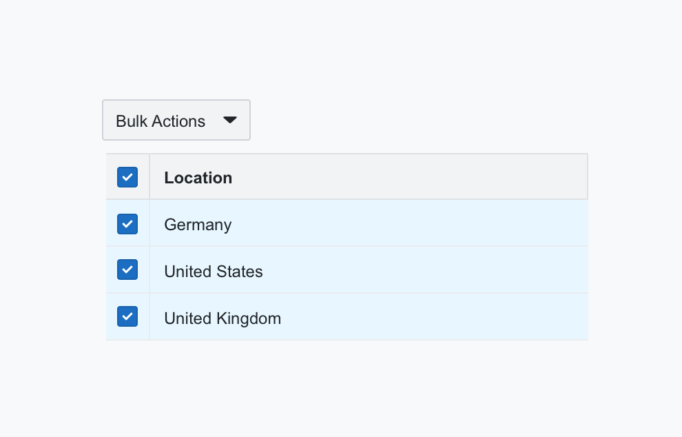
bulk action selectors in tables
Combined with labels
Checkboxes should be combined with accompanying text or a label.
Label best practices:
-
Keep label text short and concise
-
Always place the label on the right
-
Use sentence style capitalisation for label text
-
Don’t add additional characters or punctuation at the end of each label
-
Labels should be vertically centred relative to the checkbox (see example)

Best Practices
-
Use switches in combination with accompanying text or a label
-
Preference should be given to vertical checkbox lists, as it reads better
-
Try and keep checkbox lists to 8 or less items
Examples
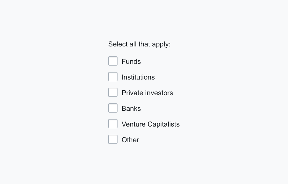
A multiple selection list in a form

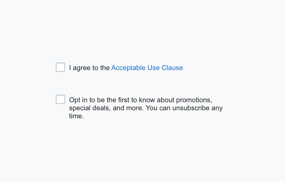
A used as a standalone checkbox on forms

As selector handle for enabling bulk actions in tables
