Buttons
Buttons are clickable items used to trigger an action.
Base
Buttons make common actions immediately visible and easy to perform with one click or tap. They can be used for any type of action, including navigation.
<button type="button" class="c-btn c-btn-primary">Button</button>Color Examples
This is an example of available colors for the Buttons element.
<div class="c-btn c-btn-primary">Button</div>

<div class="c-btn c-btn-secondary">Button</div>

<div class="c-btn c-btn-success">Button</div>

<div class="c-btn c-btn-danger">Button</div>Size Examples
This is an example of available sizes for the Buttons element.
<div class="c-btn c-btn-primary c-btn-xs">Button</div>

<div class="c-btn c-btn-primary c-btn-sm">Button</div>

<div class="c-btn c-btn-primary c-btn-lg">Button</div>Disabled State
Make buttons look inactive by adding the disabled boolean attribute to any
<button type="button" class="c-btn c-btn-primary" disabled>Primary</button>Block Button
Block buttons will span 100% width of the buttons container.
<button type="button" class="c-btn c-btn-primary c-btn-lg c-btn-block">Block level button</button>Button Groups
Button group displays multiple related actions in a row to help with horizontal arrangement and the spacing of calls to action.
<div class="c-btn-group">
  <button type="button" class="c-btn c-btn-primary">Default</button>
  <button type="button" class="c-btn c-btn-primary">Group</button>
  <button type="button" class="c-btn c-btn-primary">Buttons</button>
</div>Color Examples
This is an example of available colors for the Button Group element.
<div class="c-btn-group">
    <button type="button" class="c-btn c-btn-primary">Button</button>
    <button type="button" class="c-btn c-btn-primary">Group</button>
    <button type="button" class="c-btn c-btn-primary">Colors</button>
  </div>

  <div class="c-btn-group">
    <button type="button" class="c-btn c-btn-secondary">Button</button>
    <button type="button" class="c-btn c-btn-secondary">Group</button>
    <button type="button" class="c-btn c-btn-secondary">Colors</button>
  </div>

  <div class="c-btn-group">
    <button type="button" class="c-btn c-btn-success">Button</button>
    <button type="button" class="c-btn c-btn-success">Group</button>
    <button type="button" class="c-btn c-btn-success">Colors</button>
  </div>

  <div class="c-btn-group">
    <button type="button" class="c-btn c-btn-danger">Button</button>
    <button type="button" class="c-btn c-btn-danger">Group</button>
    <button type="button" class="c-btn c-btn-danger">Colors</button>
</div>Size Examples
This is an example of available sizes for the Button Group element.
<div class="c-btn-group">
  <button type="button" class="c-btn c-btn-primary c-btn-xs">Button</button>
  <button type="button" class="c-btn c-btn-primary c-btn-xs">Group</button>
  <button type="button" class="c-btn c-btn-primary c-btn-xs">Sizes</button>
</div>

<div class="c-btn-group">
  <button type="button" class="c-btn c-btn-primary c-btn-sm">Button</button>
  <button type="button" class="c-btn c-btn-primary c-btn-sm">Group</button>
  <button type="button" class="c-btn c-btn-primary c-btn-sm">Sizes</button>
</div>

<div class="c-btn-group">
  <button type="button" class="c-btn c-btn-primary c-btn-lg">Button</button>
  <button type="button" class="c-btn c-btn-primary c-btn-lg">Group</button>
  <button type="button" class="c-btn c-btn-primary c-btn-lg">Sizes</button>
</div>Icons
<div class="c-btn-group">
	<button type="button" class="c-btn c-btn-primary"><i class="fas fa-chart-bar"></i></button>
	<button type="button" class="c-btn c-btn-primary"><i class="fas fa-chart-pie"></i></button>
	<button type="button" class="c-btn c-btn-primary"><i class="fas fa-chart-line"></i></button>
</div>
<div class="c-btn-group">
	<button type="button" class="c-btn c-btn-primary c-btn-box"><i class="fas fa-chart-bar"></i></button>
	<button type="button" class="c-btn c-btn-primary c-btn-box"><i class="fas fa-chart-pie"></i></button>
	<button type="button" class="c-btn c-btn-primary c-btn-box"><i class="fas fa-chart-line"></i></button>
</div>Vertical
<div class="c-btn-group-vertical">
	<button class="c-btn c-btn-primary c-text-left">All</button>
	<button class="c-btn c-btn-primary c-text-left">Published</button>
	<button class="c-btn c-btn-primary c-text-left">Unpublished</button>
	<button class="c-btn c-btn-primary c-text-left">Drafts</button>
</div>
<div class="c-btn-group-vertical">
	<button class="c-btn c-btn-primary"><i class="fas fa-euro-sign"></i> EUR</button>
	<button class="c-btn c-btn-primary"><i class="fas fa-pound-sign"></i> GBP</button>
	<button class="c-btn c-btn-primary"><i class="fas fa-dollar-sign"></i> USD</button>
	<button class="c-btn c-btn-primary"><i class="fas fa-dollar-sign"></i> USD</button>
</div>
<div class="c-btn-group-vertical">
	<button class="c-btn c-btn-box c-btn-sm c-btn-primary"><i class="fas fa-robot"></i></button>
	<button class="c-btn c-btn-box c-btn-sm c-btn-primary"><i class="fas fa-robot"></i></button>
	<button class="c-btn c-btn-box c-btn-sm c-btn-primary"><i class="fas fa-robot"></i></button>
</div>
<div class="c-btn-group-vertical">
	<button class="c-btn c-btn-box c-btn-primary"><i class="fas fa-robot"></i></button>
	<button class="c-btn c-btn-box c-btn-primary"><i class="fas fa-robot"></i></button>
	<button class="c-btn c-btn-box c-btn-primary"><i class="fas fa-robot"></i></button>
</div>Standard Button
Outline Button
Submit Button
Link Button
Icon Button
Overview
Types & Usage
| Type | Decription |
|---|---|
| Primary Button | Primary buttons draw attention to the primary action within a screen, component or interaction. Not all screens will require a primary button. |
| Action Button | Action buttons represent and draw attention to an action where an entity is created or introduced into the workflow. |
| Danger Button | Danger buttons represent and draw attention to a destructive action where something is discarded or deleted. |
| Secondary Button | Secondary buttons are the standard button for general use. Secondary buttons are often used in combination with a primary button, to represent an opposing action. |
| Link Button | Link buttons are used in combination with Primary and Secondary buttons to highlight less critical actions or supporting links. |
| Icon Button | Icon-only buttons are used for frequently used actions, typically where space is restricted. |
| Button Group | Button groups are used to group frequently used, related actions. |
States
All buttons have 4 potential states:
-
hover
-
active
-
inactive
-
disabled
Labels
Limit wording on button labels to two to three words max. Try and use wording and terms that need no additional explanation.
Combined with icons
All buttons can be combined with icons to add additional visual emphasis and to identify common repetitive actions.
Combined with tooltips
Icon buttons should always be combined with a Tooltip to make it clear what action the button will perform.
Best Practices
-
Use one Primary, Action or Danger button on a page or screen area
-
Keep buttons to a minimum on a page or screen area
-
Use clear button labels limited to less than three words
-
Try and create context with the design, so buttons text can be simple and to the point
-
Use icons that are clear in meaning and combine with tooltips where needed
Examples
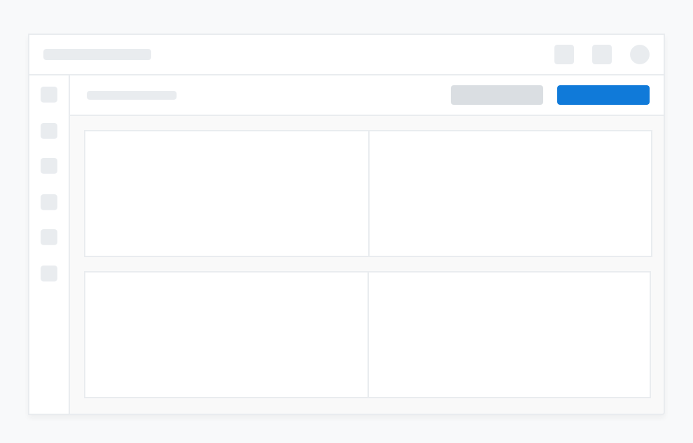
A primary button used in combination with a secondary button
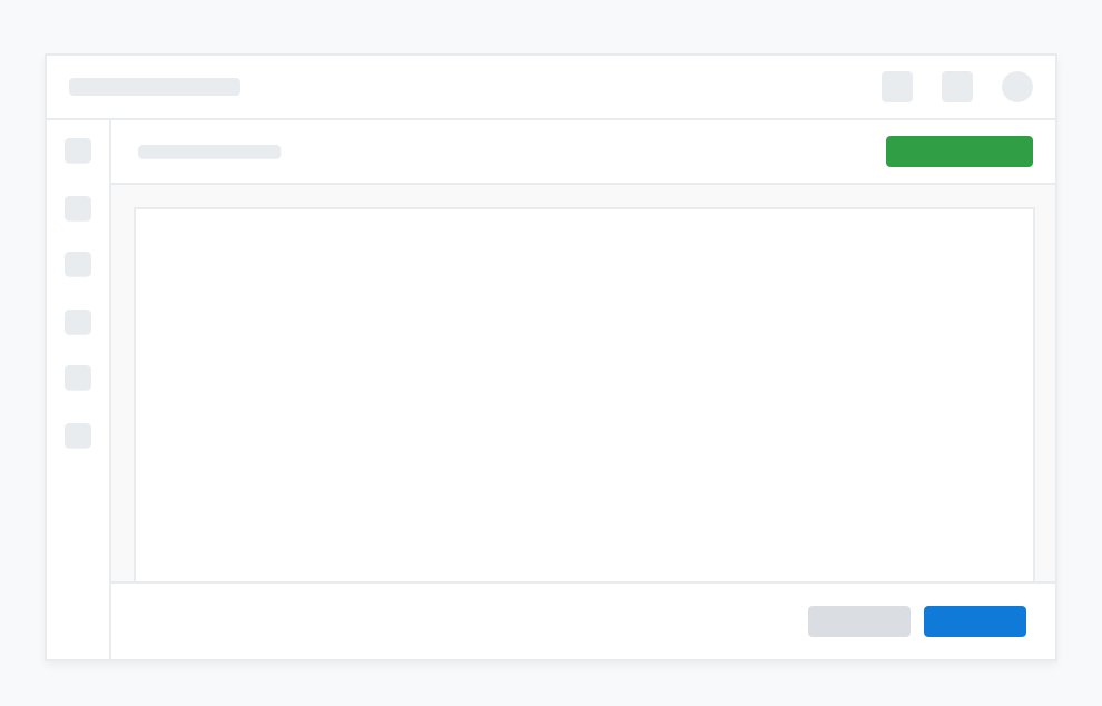
An action button used in combination with a primary/secondary button combination
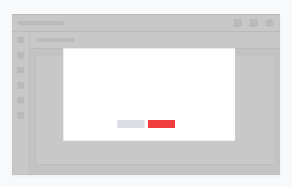
A danger button used to signal a destructive action (presented in a modal)
How secondary buttons could compliment a primary button
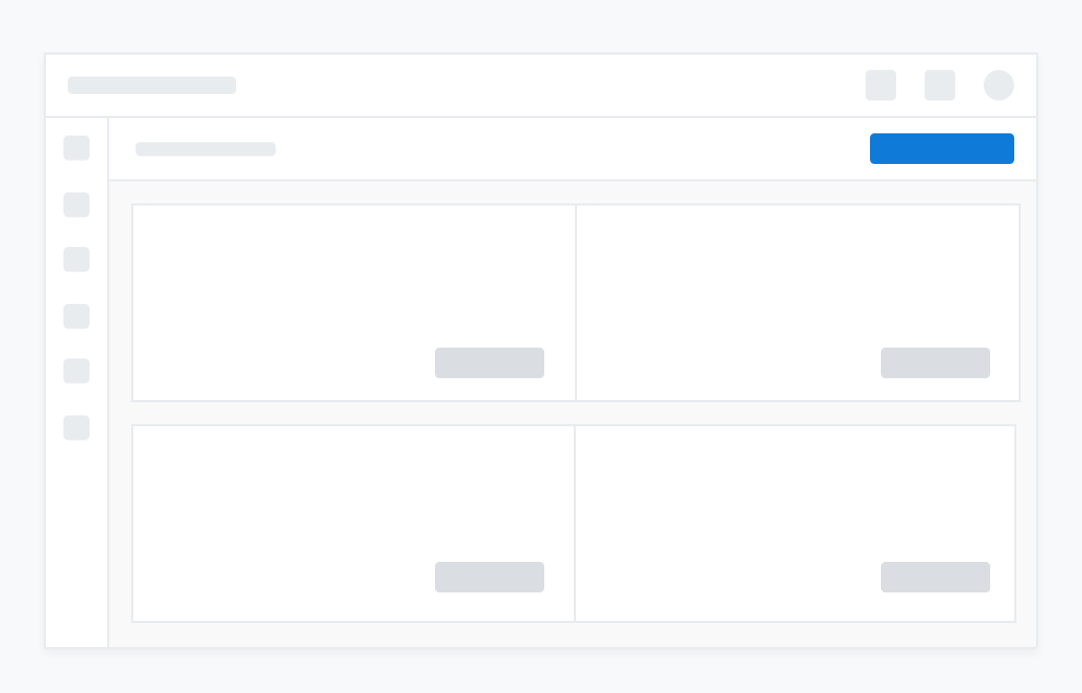
Link buttons used in combination with secondary buttons
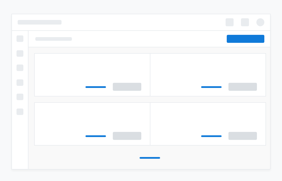
Icon buttons used with a table