Alerts
Alerts are used to communicate errors, warnings, confirmation messages and critical information that can affect the user experience.
Base
Alerts provide contextual information relevent to the user.
The default alert does not imply action. The color is simple gray and doesn’t include an icon or close action.
<div class="c-alert">
 <strong>Oh snap there is a problem!</strong>
</div>Color Examples
This is an example of available colors for the Alerts element.
<div class="c-alert c-alert-primary">
  <i class="fa fa-exclamation-circle c-alert-icon" aria-hidden="true"></i>
    <div class="c-alert-content"><strong>
    This is a Primary alert
      </strong>
    </div>
    <a href="#" class="c-alert-close" aria-hidden="true"></a>
</div>

<div class="c-alert c-alert-success">
  <i class="fa fa-exclamation-circle c-alert-icon" aria-hidden="true"></i>
    <div class="c-alert-content"><strong>
    This is a Success alert
      </strong>
    </div>
    <a href="#" class="c-alert-close" aria-hidden="true"></a>
</div>

<div class="c-alert c-alert-warning">
  <i class="fa fa-exclamation-circle c-alert-icon" aria-hidden="true"></i>
    <div class="c-alert-content"><strong>
    This is a Warning alert
      </strong>
    </div>
    <a href="#" class="c-alert-close" aria-hidden="true"></a>
</div>

<div class="c-alert c-alert-danger">
  <i class="fa fa-exclamation-circle c-alert-icon" aria-hidden="true"></i>
    <div class="c-alert-content"><strong>
    This is a Danger alert
      </strong>
    </div>
    <a href="#" class="c-alert-close" aria-hidden="true"></a>
</div>Alert top
Designed to sit flush vertically and horizontally within a container. In most cases at the very top of the page.
<div class="c-alert c-alert-top c-alert-primary">
  <i class="fa fa-exclamation-circle c-alert-icon" aria-hidden="true"></i>
    <div class="c-alert-content">
      <div class="c-alert-title">Primary Alert Title</div>
        Lipsum dolor sit amet, consectetur adipiscing elit sed do eiusmod tempor incididunt ut labore et dolore magna aliqua.</div>
  <a href="#" class="c-alert-close" aria-hidden="true"></a>
</div>
<br>

<div class="c-alert c-alert-top c-alert-success">
  <i class="fa fa-exclamation-circle c-alert-icon" aria-hidden="true"></i>
    <div class="c-alert-content">
      <div class="c-alert-title">Success Alert Title</div>
        Lipsum dolor sit amet, consectetur adipiscing elit sed do eiusmod tempor incididunt ut labore et dolore magna aliqua.</div>
  <a href="#" class="c-alert-close" aria-hidden="true"></a>
</div>
<br>

<div class="c-alert c-alert-top c-alert-warning">
  <i class="fa fa-exclamation-circle c-alert-icon" aria-hidden="true"></i>
    <div class="c-alert-content">
      <div class="c-alert-title">Warning Alert Title</div>
        Lipsum dolor sit amet, consectetur adipiscing elit sed do eiusmod tempor incididunt ut labore et dolore magna aliqua.</div>
  <a href="#" class="c-alert-close" aria-hidden="true"></a>
</div>
<br>

<div class="c-alert c-alert-top c-alert-danger">
  <i class="fa fa-exclamation-circle c-alert-icon" aria-hidden="true"></i>
    <div class="c-alert-content">
      <div class="c-alert-title">Danger Alert Title</div>
        Lipsum dolor sit amet, consectetur adipiscing elit sed do eiusmod tempor incididunt ut labore et dolore magna aliqua.</div>
  <a href="#" class="c-alert-close" aria-hidden="true"></a>
</div>
<br>In columns with icons
<div class="c-row">
    <div class="c-col">
    <div class="c-alert c-alert-danger">
      <i class="fa fa-exclamation-circle c-alert-icon" aria-hidden="true"></i>
        <div class="c-alert-content"><strong>
        This is a  alert
          </strong>
        </div>
        <a href="#" class="c-alert-close" aria-hidden="true"></a>
    </div>
    </div>
    <div class="c-col">
    <div class="c-alert c-alert-success">
      <i class="fa fa-exclamation-circle c-alert-icon" aria-hidden="true"></i>
        <div class="c-alert-content"><strong>
        This is a  alert
          </strong>
        </div>
        <a href="#" class="c-alert-close" aria-hidden="true"></a>
    </div>
    </div>
</div>Toast
<div class="c-toast-alert c-toast-alert-primary">
  <i class="c-toast-alert-icon fa fa-check-circle"></i>
  Nam porttitor blandit accumsan.
  Ut vel dictum sem, a pretium dui.
  <a href="#" class="c-toast-alert-close"></a>
</div>

<div class="c-toast-alert c-toast-alert-success">
  <i class="c-toast-alert-icon fa fa-check-circle"></i>
  Nam porttitor blandit accumsan.
  Ut vel dictum sem, a pretium dui.
  <a href="#" class="c-toast-alert-close"></a>
</div>

<div class="c-toast-alert c-toast-alert-warning">
  <i class="c-toast-alert-icon fa fa-check-circle"></i>
  Nam porttitor blandit accumsan.
  Ut vel dictum sem, a pretium dui.
  <a href="#" class="c-toast-alert-close"></a>
</div>

<div class="c-toast-alert c-toast-alert-danger">
  <i class="c-toast-alert-icon fa fa-check-circle"></i>
  Nam porttitor blandit accumsan.
  Ut vel dictum sem, a pretium dui.
  <a href="#" class="c-toast-alert-close"></a>
</div>Overview
Types of alerts available:
Banner Alerts
Banner alerts communicate critical system status information that could affect the user.
Placement & Behaviour
-
Banner alerts slide in from the top of the browser, pushing down the content in the browser and remains there until the issue is resolved or it is dismissed.
-
Banner alerts can be persistent or dismissible, depending on how serious the issue is that it is communicating.
-
Note: Persistent banner alerts can also be hidden by clicking on the hide button. When a banner is hidden it will not show for the duration of a user session, but will reappear when the user logs in again, provided the condition (for it’s activation) is still valid.
Variations
Banner Alerts should be used sparingly to communicate informational, warning or danger messages.
Best Practices
-
Only show one Banner Alert at a time
-
Only use Banner Alerts to communicate system information and warnings
-
Allow users to hide or dismiss Banner Alerts that communicate non-critical system information
-
Keep copy on all alerts short and to the point
-
If available, do include links for the user to either rectify the situation or find out more information
Examples
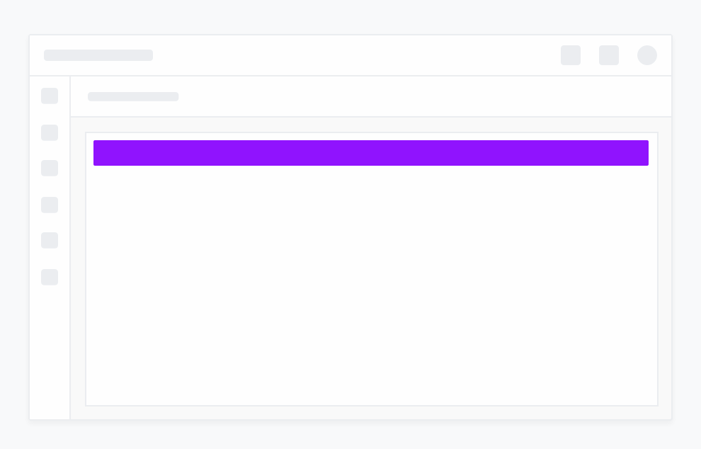
An dismissible informational Banner alert with a link to more information

A persistent danger Banner alert

Box Alerts
Box alerts communicate the status of a page or component, sometimes in response to user actions.
Placement & Behaviour
-
Box alerts fade in at the top of the page or component it relates to, pushing down the content and remains there until the issue is resolved or it is dismissed.
-
Box alerts can be persistent or dismissible, depending on how serious the issue is that it is communicating.
Variations
Box Alerts should be used to communicate informational, warning or danger messages.
Best Practices
- Try to show only one Box alert at a time. Two at the most in extreme cases
- If two Box alerts are shown at the same time, the latest one will appear at the top
- Box alerts must sit in the container of the page or component it relates to
- Allow users to hide or dismiss Box alerts that communicate non-critical system information
- Keep copy on all alerts short and to the point
- If available, do include links for the user to either rectify the situation or find out more information
Examples
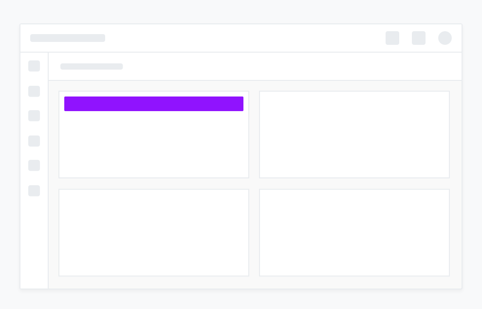
A persistent danger Box alert

An dismissible informational Box alert with a link to more information

Toast Alerts
Toast alerts serve as a feedback & confirmation mechanism after the user performs an action.
Placement & Behaviour
-
Toast alerts slide in from the top right corner of the browser, overlaying the content. It’s position is fixed ie. is not affected by scrolling.
-
Banner alerts auto-clear after a period of time but can also be dismissed by the user.
Variations
Toast Alerts should be used to communicate informational, warning, danger or success messages in response to user actions.
Best Practices
-
Always animate Toast alerts in from the top right corner
-
Toast alerts should appear in order of the latest at the top
-
Toast alerts must appear immediately in response to a user action
-
Keep copy on all alerts short and to the point
-
If available, do include links for the user to either rectify the situation or find out more information
Examples
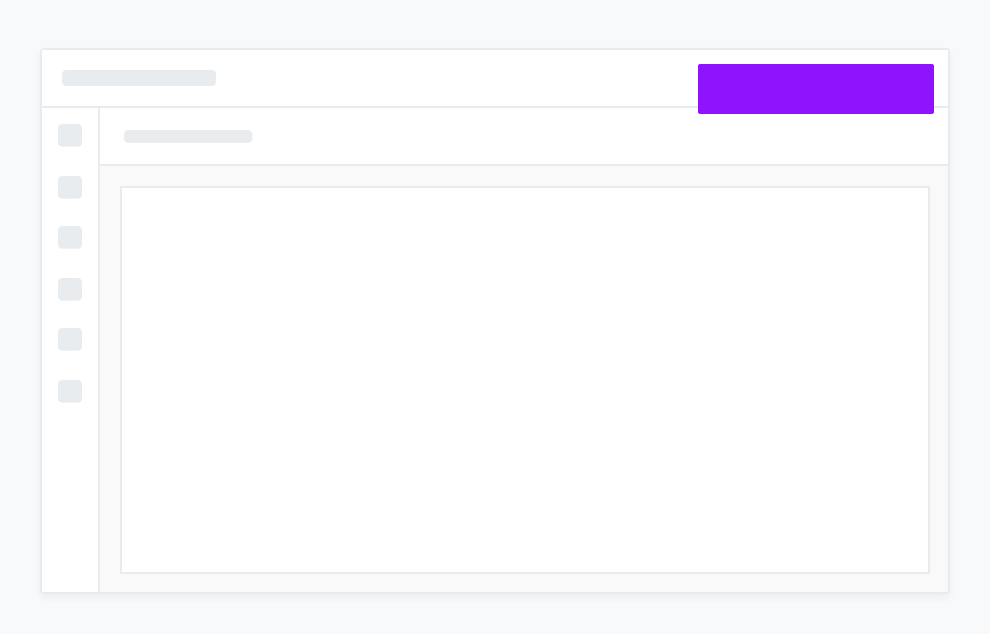
An informational Toast alert

A success Toast alert

A danger Toast alert