Action Panel
Action panels are semi-interruptive panels that provide additional functionality or display supplementary content in the context of the user's current screen.
Base
The default Action Panel is anchored to the left, spans the height of the screen, and not visible by default.
<div class="c-action-panel"></div>Visibility can be toggled with with the class .c-action-panel-visible
<div class="c-action-panel c-action-panel-visible"></div>Adding Content
There a various supported layouts for adding a content to the action panel.
Adding the header and body section
<button class="c-btn c-btn-secondary" id="actionPanelHeader-trigger">Toggle Header Example</button>

<div class="c-action-panel">
  <header class="c-action-panel-header">
    <div class="c-action-panel-header-title">
      Simple Header
    </div>
    <div class="c-action-panel-header-menu">
      <a class="c-action-panel-close"></a>
    </div>
  </header>

  <div class="c-action-panel-body">
  </div>
</div>Complex header and tabs in body
Additionally we can have a more complex header and add tab actions to the body.
<button class="c-btn c-btn-secondary" id="actionPanelHeaderComplex-trigger">Toggle Complex Header Example</button>

<div class="c-action-panel">
  <header class="c-action-panel-header">
    <div class="c-action-panel-header-title">
      Action Panel Title
    </div>
    <div class="c-action-panel-header-subtitle">
      Action Panel Subtitle
    </div>
    <div class="c-action-panel-header-menu">
      <a class="c-action-panel-header-menu-icon" href="#">
        <i class="fa fa-expand" aria-hidden="true"></i>
      </a>
      <a class="c-action-panel-header-menu-icon" href="#">
        <i class="fa fa-cog" aria-hidden="true"></i>
      </a>
    </div>
  </header>

  <div class="c-action-panel-body">
    <ul class="c-tabs c-tabs-fullwidth c-bg-white">
      <li class="c-tab-item">
        <a class="c-tab-item-link" href="#">Tab A</a>
      </li>
      <li class="c-tab-item">
        <a class="c-tab-item-link c-tab-item-link-active" href="#">Tab B</a>
      </li>
      <li class="c-tab-item">
        <a class="c-tab-item-link" href="#">Tab C</a>
      </li>
      <li class="c-tab-item">
        <a class="c-tab-item-link c-tab-item-link-disabled" href="#">Tab D</a>
      </li>
    </ul>
  </div>

</div>Footer
Additionally we can add a footer with multiple alignment options.
<button class="c-btn c-btn-secondary" id="actionPanelFooter-trigger">Toggle Footer Example</button>

<div class="c-action-panel">
  <header class="c-action-panel-header">
    <div class="c-action-panel-header-title">
      Action Panel Large Title
    </div>
    <div class="c-action-panel-header-subtitle">
      Action Panel Large Subtitle
    </div>
    <div class="c-action-panel-header-menu">
      <a class="c-action-panel-header-menu-icon" href="#">
        <i class="fa fa-cog" aria-hidden="true"></i>
      </a>
      <div class="c-action-panel-header-menu-icon">
        <a class="c-action-panel-close"></a>
      </div>
    </div>

  </header>

  <div class="c-action-panel-body">

  </div>

  <footer class="c-action-panel-footer">
    <div class="c-action-panel-footer-item c-action-panel-footer-item-left">
      <button class="c-btn c-btn-primary">Button</button>
    </div>
    <a class="c-action-panel-footer-item c-action-panel-footer-link c-action-panel-footer-item-center" href="#">
      Footer Link
    </a>
    <div class="c-action-panel-footer-item c-action-panel-footer-item-right">
      <button class="c-btn c-btn-primary">Button</button>
    </div>
  </footer>
</div>Larger Size
<button class="c-btn c-btn-secondary" id="actionPanelLarge-trigger">Toggle Large</button>

<div class="c-action-panel c-action-panel-lg">
  <header class="c-action-panel-header">
    <div class="c-action-panel-header-title">
      Action Panel Large Title
    </div>
    <div class="c-action-panel-header-subtitle">
      Action Panel Large Subtitle
    </div>
    <div class="c-action-panel-header-menu">
      <a class="c-action-panel-header-menu-icon" href="#">
        <i class="fa fa-cog" aria-hidden="true"></i>
      </a>
      <div class="c-action-panel-header-menu-icon">
        <a class="c-action-panel-close"></a>
      </div>
    </div>

  </header>

  <div class="c-action-panel-body">

  </div>

  <footer class="c-action-panel-footer">
    <div class="c-action-panel-footer-item c-action-panel-footer-item-left">
      <button class="c-btn c-btn-primary">Button</button>
    </div>
    <a class="c-action-panel-footer-item c-action-panel-footer-link c-action-panel-footer-item-center" href="#">
      Footer Link
    </a>
    <div class="c-action-panel-footer-item c-action-panel-footer-item-right">
      <button class="c-btn c-btn-primary">Button</button>
    </div>
  </footer>
</div>Notifications Example
<button class="c-btn c-btn-secondary" id="actionPanelNotifications-trigger">Toggle Notifications</button>

<div class="c-action-panel c-notifications">
  <header class="c-action-panel-header">
    <div class="c-action-panel-header-title">
      Notifications
    </div>
    <div class="c-action-panel-header-menu">
      <a class="c-btn c-btn-icon-secondary c-btn-icon" href="#">
        <i class="fa fa-cog" aria-hidden="true"></i>
      </a>
    </div>
  </header>

  <div class="c-action-panel-body">
    <div class="c-media-list c-media-list-hover">
      <div class="c-media c-media-middle">
        <div class="c-avatar c-avatar-lg c-avatar-cyan">
          <i class="fab fa-dropbox"></i>
        </div>
        <div class="c-media-body">
          <div class="c-text-md">Notification Content</div>
          <div class="c-text-sm c-text-bold">Name/App</div>
        </div>
      </div>
      <div class="c-media c-media-middle">
        <div class="c-avatar c-avatar-lg c-avatar-lime">
          <i class="fab fa-apple"></i>
        </div>
        <div class="c-media-body">
          <div class="c-text-md">Notification Content</div>
          <div class="c-text-sm c-text-bold">Name/App</div>
        </div>
      </div>
      <div class="c-media c-media-middle c-media-read">
        <div class="c-avatar c-avatar-lg c-avatar-orange">
          <i class="fab fa-amazon"></i>
        </div>
        <div class="c-media-body">
          <div class="c-text-md">This Notification is read</div>
          <div class="c-text-sm c-text-bold">Name/App</div>
        </div>
      </div>
      <div class="c-media c-media-middle">
        <div class="c-avatar c-avatar-lg c-avatar-grape">
          <i class="fab fa-xbox"></i>
        </div>
        <div class="c-media-body">
          <div class="c-text-md">Notification Content</div>
          <div class="c-text-sm c-text-bold">Name/App</div>
        </div>
      </div>
    </div>
  </div>

</div>With Backdrop
Internal
The same action panel can be used within the UI and not offscreen. This requires the parent class .c-wrapper to enclose all of your content and .c-action-panel-push to control the panel.
You can also use c-action-panel-left in this scenario.
Play with a demo example here.
Storybook iframe
Overview
Usage
Action panels can be implemented where users need to access additional functionality or information without interrupting their current workflow.
Structure
An action panel is composed of a:
-
open control
-
panel (container)
-
close button (close control)
-
Behaviour
-
Action panels slide in from the left or right edge of the browser when triggered via an open control, and closed via a close button.
The action panel can exist on two planes:
-
A layer above the screen content ie. sliding over and obscuring a part of the content. This is the default option.
-
The same layer as the screen content ie. it will push the content to the side to make space on the screen
| Type | Plane | Focus | Defining Behavior |
|---|---|---|---|
| Default | Above screen | Supplementary | Open using trigger and close using close button. Can interact with content on screen. |
| Elastic | Same as screen | Supplementary | Open using trigger and close using close button. Can interact with content on screen. |
| Overlay | Above screen | Primary | Open using trigger and close using close button or clicking on the screen overlay. Cannot interact with content on screen. |
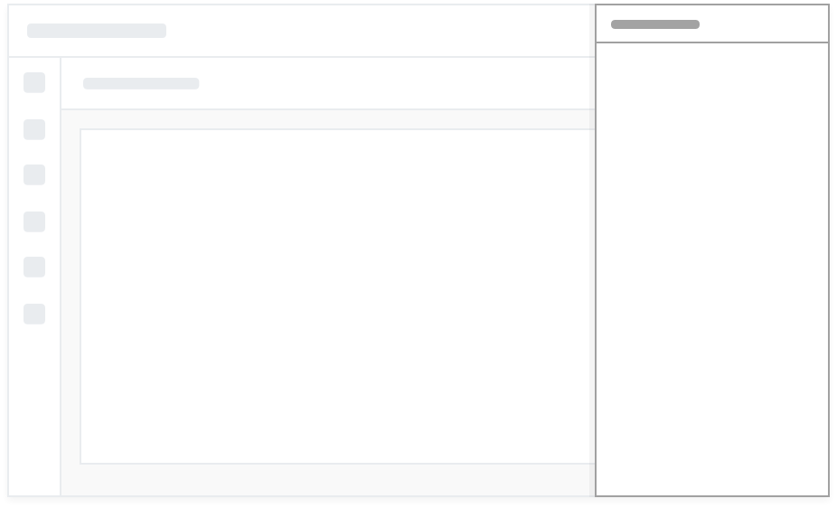
Default Action Panel
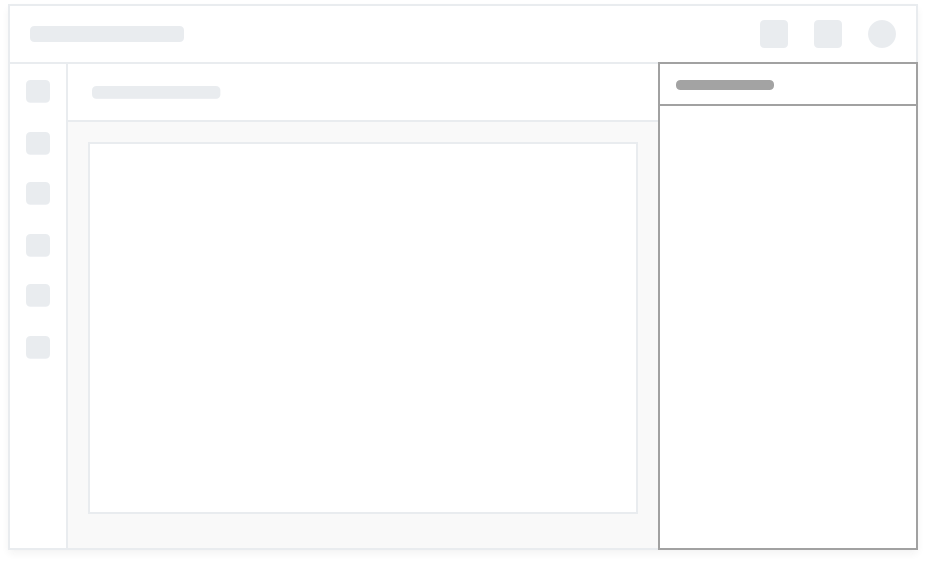
Elastic Action Panel
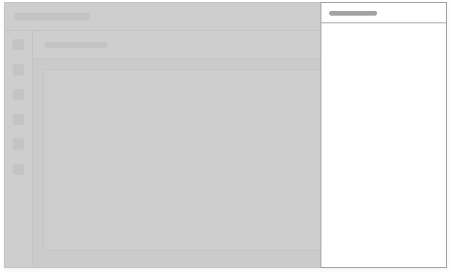
Overlay Action Panel
Structure
All action panels will have a header, close button and content area. Additional options are:
-
Additional controls in the header
-
Tabs
-
Footer with controls
States
The action panel has two states:
-
open
-
closed
Combined with…
Action panels can be combined with various controls and components depending on the use case and requirements.
Best practices
-
An action panel should not overlap controls or information required in the workflow that it supports
-
The controls and information in an action panel should be immediately relevant and supportive of the visible screen and active workflow of the user
-
The action panel should ideally take up as little screen real estate as is possible to get the job done
-
Action panels are by default supplementary and contents should be designed with this in mind. In the case of the overlay action panel it is the primary focus.
Examples
The overlay action panel is used to access contact details
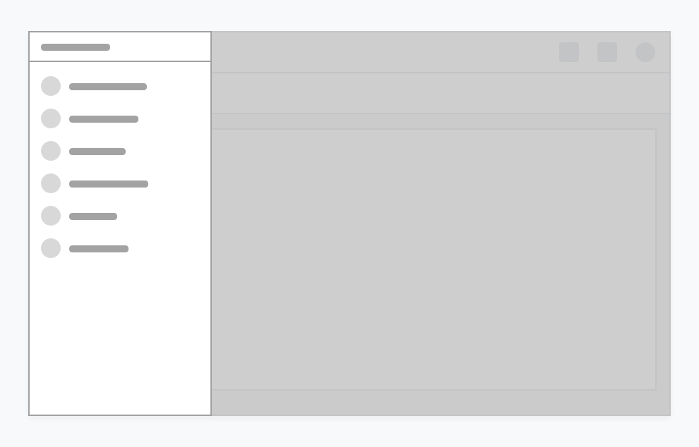
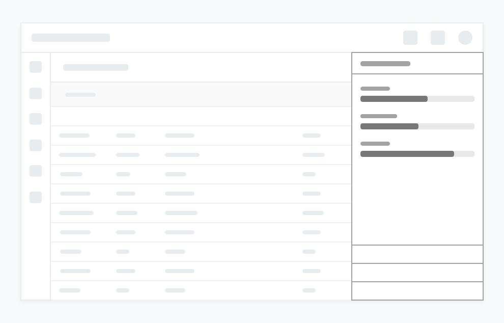
The default action panel is used as a Notifications panel
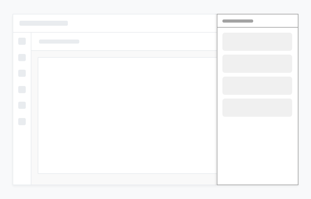
The elastic action panel is used as a Deal Summary panel on the Sales Platform